Jimdo CSS tutorial has the right sprinking of CSS3 and HTML5
Learn CSS3 Animation with our Jimdo Tutorial
Welcome to the Jimdo Tutorial on animating images and graphics using CSS3. When your finished with this 11 part
tutorial you will have learned how to animate a graphics orb while rotating and expanding a image using your mouse.
This Jimdo Tutorial covers everything from creating a new HTML/CSS widget to opening the head section and building an inline style sheet that you can modify. You also
will learn something about classes and id elements, how to size graphics, how to expand images and finally, if you have the time, a little on transforming and translating images using
CSS3.
So let's power up our Jimdo website, create a brand new web page and have fun learning some CSS3 animation and image manipulation.
Edu : Jimdo | Website : http://shawwebsitedesign.jimdo.com
Hover over the final product and take her for a spin.
1. Create a blank Jimdo page
Open up a blank page on your Jimdo website and make it hidden using the eyeball icon. This way you can experiment without prying eyes. If make a mistake or are stuck the css code is
included in a text file at the end of this tutorial.
With your new Jimdo Page, create the following:
A horizontal line element.
Two 50px Spacing elements.
and finally add another horizontal line element.
You should now have 4 elements in place looking something like this:
We now have a boxed in area on our Jimdo page to hold the animation we are going to display.
The next step is to place the html5 snippet code in place. Snippets allow you to put in special markup code such as Javascript and or HTML Tags and Elements.
There is two ways to insert this code.
The first way is to create a text element using Jimdo's element menu bar on the left side of the page. The bar will display when you hover over any existing
element on the page. After creating a new text element you would then select the 'Edit HTML Source' button located on the top html menu. This now allows you to place the code behind the
text editor. This is a little complicated but there is an easier way.
Hover over the first 50px element we created
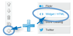
From the Jimdo element menu bar on the left side of the page, do the following:
Select Add New Element
From the Drop down list select Widget/HTML
Your going to add a new widget/HTML element
A Jimdo widget now opens up ready for your code.
Copy and paste the snipped code below into the widget you just created or manually enter in the text.
Between elements, attributes, tags, divs and classes, it can get confusing at times. What the html code represents can be a chore to understand but hopefully what follows might clear
things up for you.
Let's begin first by quickly talking about tags, elements and attributes.
Tags can be thought of as a piece of land.
Elements can be thought of as everything between the tags < >. In our code snippet the element is div. Think of an element as the house on the land.
The location of the house can be thought of as an attribute. In our code snippet the attributes are class and id. The values assigned are
ball-background, ball and shadow.
Again, just think of the div tags we created as a piece of empty land (div) that has a house (attribute) . The house has an address to receive mail (class id) and values attached.
Now if you look at our code snippet you will see that we have created 3 Div tags or 3 houses so to speak. Notice they have an opening tag <> and a closing tag
</> reference. This creates a division or a section and allows the grouping of elements for easy reference. Every tag inside the div will be thought of as a child of that div.
Each Tag or house has been assigned their first attributes
the first div tag has an id attribute named ball-background
the second and third div tags are class attributes named ball and shadow
Notice that the div tags are not displaying anything. This is due to the fact that they are sitting empty, for now.
If you hover between the 2 50px space elements you created you will see a thin element presented for editing. Clicking on it will display the code snippet element you just entered.
Now is a good time to explain the id and class definitions:
id attributes can be thought of as:
Postal addresses so we can find the tag or element inside the tag.
You can put multiple id's on a webpage but they must have a unique name that no other id or class has.
The name of the id should describe the element or tag it represents.
Always use lowercase letters.
If more than one word is used in the name, use a dash('-') or an underscore ('_') instead of spacing the words apart.
The element the id represents can be referenced by using the pound symbol '#'
You can place the id in a link or address query for navigational purposes.
An id is more specific than a class, hence its attributes are stronger.
class attributes can be thought of as:
Postal addresses so we can find the element or house itself.
You can put multiple classes on one webpage but they cannot share an id name.
The name of the class should describe the element it represents.
Use lowercase letters but for me personally, I like to capitalize the first letter of the first word in a class.
If more than one word is used in the name, use a dash('-') or an underscore ('_') instead of spacing the words apart.
You can have multiple, same named classes on a webpage.
A class is more specific than the element it is in, hence its attributes are stronger but a class is weaker than an id.
You can make attribute changes to all elements in the same class by using referencing the class name assigned to it.
The attributes the class represents are referenced using the period symbol '.'
Hopefully now you should be able to see that class and id's are user-defined address markers so to speak. This allows you to change things about a tag or element and,
in the case of id, reference its location directly using links.
Remember :
The Div tags we just created can be thought of as empty houses waiting for movers to bring in furniture. The address of the houses are represented by the class or id assigned value or
attribute.
Using the above rules for class and id allows us to create only one ball-background div tag due to the assigned 'id' attribute.
But we are able to create many ball and shadow div tags because they have been assigned the 'class' attribute.
If your still confused, have a little patience, it will come to you. It is going to get a little more complicated now because we are going to start filling up those div tags with
some interesting attributes.
4. Creating our first Jimdo CSS3 Internal Style Sheet
Now the Jimdo fun begins. We are going to start creating our styles to fill in the div tags we have set down in our Jimdo HTML. You will see how the id and
div tags interact and how you can place margins, size an image and create transitions.
To create our CSS3 Style Sheet rule we are first going to modify the head element of our Jimdo page and create an internal style sheet. Don't worry, you
won't break anything.
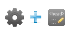
In edit mode, open the Jimdo drop down menu on the top right of the page. Click the setting icon and then select the Edit Head icon from the website category.
Use these icons to access Jimdo's head
Scroll down to the end of the existing code, select the last line of code and then make sure you are at the very end by using the arrow keys if necessary.
Hit enter 3 times to create some space for yourself to work.
Now copy / paste or manually type in the above code into the free space you created in the head of the page.
Look at the code and observe the opening <style> and closing <style> tags. This creates an address or space to place information just like the empty div tags we place in step
2. This created style element is then assigned an inline attribute of 'text/css'. This tells the browser that every element inside this style tag can be thought of as a style and that this whole
block is a now a stylesheet.
Before we save the information we should get into the habit of leaving comments about the changes we make. To give you more practice grab the code snippet below
and place it in the head section twice, once above and below the code you entered or pasted. '/*' and '*/' tells your browser that everything inside is a remark and should be
ignored.
/*
-- remarks --
*/
Enter in the a description of the code, your name and date into the top remark. In the bottom remark just announce the end of the code change. Your comment should be now understood
in future by anyone following behind you.
5. Understanding the CSS3 Code for our Jimdo Image
Your first hand-made Jimdo style sheet must have an opening tag and closing tag and must have a type assigned to it.
<style type="text/css">
..
..</style>
We next need the parser to ignore the information on the sheet otherwise we could get validation errors so we need to place the opening and closing CDATA tags
/*<![CDATA[*/
..
../*]]>*/
Now it's time to create our style sheet rule. Remember with CSS everything has a beginning and an end.
First we need declare the style effects of the ball-background div element which is sitting empty. To assign these effects we use the div tag followed by the
pound sign # and then the name of the id itself. Make sure that you leave omit spaces and remember that the pound sign denotes the id attribute. This first part of the style
sheet rule is called the selector.
Take note that after the selector there is a space and then a open-curly-brace and a closing-curly-brace. The content inside these braces will hold the assigned
values of the div. This second part of the style sheet rule is called the declaration.
selector {declaration}
div#ball-background {
....
...}
Declarations:
A declaration has two parts: property and value or method, separated by a colon. Each selector can have more than one declaration. Remember to end each
declaration with a semi-colon.
We are first going to set the maximum width and height of the div in pixels.
width: 400px;
height: 400px;
Next we need need to set the top , right, bottom and left margins in that order. This creates a transprarent border inside the div. The div's new dimension will now
expand to 470px wide by 485 high.
margin: 30px 45px 55px 25px;
Now we need an image for the div. I have uploaded the image used here to my google+ account and the address is provided below.
Moving along, we now need to size the image. The image loaded is smaller than the 400 x 400 px of the div. We do not want to repeat it over again to fill the area in. Just
so you know, we could of used a very small image to create a pattern to fill the div.
background-repeat:no-repeat;
We find out unfortunatly that the image we are loading is smaller than the 400x400 pixels, so we need to stretch the image to fill in the div area. The
image is currently 300px x 300px so the aspect ratio will remain the same. The only thing lost is a little resolution by the stretching.
background-size:100% 100%;
Finally we are going to create a transition event in the next step. We need to set a time limit of 3 seconds between changes in the div's state. We are
using all other defaults such as easing to save your eyeballs from reading too much.
transition-duration: 3s;
Save the file and look over the information to check that it has been validated. If Jimdo catches invalid markup it will remove it.
You need to now reload the page for the new information to take effect. Once the page is refreshed you should see the image displayed where you inserted the div tags.
Now we are going to bring our div id to life in our Jimdo Tutorial.
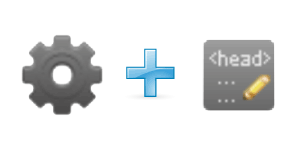
In edit mode, again open the Jimdo drop down menu on the top right of the page. Click the setting icon and then select the Edit Head icon from the website category. Scroll down and
find the code you just placed.
Use the select and head icons
Starting at the div#ball-background scripts closing curly brace, create some space using the enter key so you have some room to work. You should always leave one
space between each element declaration you make.
A cut-out example of your head section
div#ball-background{
.....existing code.............
}
<-- place hover code here --->
/*]]>*/
</style
Copy-paste or type in the hover script located below into the space you just created for yourself in the head section.
We need to first declare a hover selector on the id div. This will allow us to trigger an event. Take note that hover must come after link and visited if present.
div#ball-background:hover {
....
...}
The hover trigger is now in place and now we need to apply the declarations to execute the event. Before we continue, notice the pound sign '#' in the selector and remember that it
refers to an 'id'.
Lets now look at the first transform property declarations.
-webkit-transform: scale(1.4) rotate(180deg);
The words before the colon ':' refer to the browser being used
But the '-' at the beginning tells us that the browser's different versions have not finalized the default code for this event.
The scale value creates a 2D scale transformation. In this example we will increase the size of the div's background image by 40%.
The rotate value will rotate the div's background by 180 degrees.
Because the transform property is in development on some browsers, we unfortunately must make seperate calls using vendor prefixes to each browser to allow the event
to happen. If you do not have a browser that supports the event, have not updated your browser or do not make calls to the browsers developing the event, nothing will happen on your screen. Hope
that makes sense.
Google Chrome and Opera browsers currently use Webkit so we know those browsers will run the -webkit-transform event we have listed above.
-moz-transform tells us that Firefox supports the event and this will work on their browsers.
-o-transform tells us that Opera supports the event and this will work on their browsers.
-ms-transform tells us that Windows Explorer supports the event and this will work on their browsers.
Transform is the final prefix and should always be last because it is the default setting. Any browser not covered with the other prefixes and or has finalized development
will run this transition.
If you have the above browsers and this event does not trigger may I suggest you update your browser.
Save the Head file again and look over the information to check that it has been validated. If Jimdo catches invalid markup it will remove it.
You need to now reload the page again for the new information to take effect. Once the page is refreshed you should see the image and when you hover over the image the event will trigger.
The event will last 3 seconds to reach its end state and if you move your mouse off the image it will slowly return to its original state.
Now we are going to create an Orb for our Jimdo Tutorial and it's Shadow
In edit mode, again open the Jimdo drop down menu on the top right of the page. Click the setting icon and then select the Edit Head icon from the website category. Scroll down again
and find the hover code you just placed.
Time to enter the head section again
Starting at the closing curly brace again of the div#ball-background:hover script you just installed, create some space again using the enter key so you have some
more room to work.
A cut-out example is provided again of your head section
div#ball-background:hover {
.....existing code.............
}
<-- place div.ball {} and div.ball + div.shadow code here --->
/*]]>*/
</style
Copy-paste or type in the div.ball {} and div.ball + div.shadow script located below into the space you just created for yourself in the head section.
9. Understanding the CSS3 Code for our Ball and Shadow
In your Jimdo head section you should notice first that we have some of the same properties as the ball-background div but with different values.
You also should of noticed that instead of a '# pound sign we have a period connecting the terms in the selector. This tells us that we are dealing with a class div. Make sense yet?
Now the fun part.
div.ball + div.shadow creates an adjacent sibling relationship. This is important because we want the shadow to follow the ball. The rule will apply to all shadows
that are created right after a ball element and both the shadow and the ball must have the same parent, which in our case is the ball-background div element. Might be a little confusing but just
remember they now can operate in sync.
The Declarations of the ball and shadow
We are first going to set the maximum width and height of the divs in pixels.
The first ball div is square in size and 200px by 200px
The shadow div is a rectangle and 200px by 40px in size.
The first ball div is created using the ball-background div as a parent. This div sits inside the ball-background div and expands outwards 200px from the top left and 200 px down.
With me so far?
The second div or the shadow div has the ball background div as its parent. It also sits inside the ball-background div but due to the first ball taking up space it must sit below
it. The shadow is 200px in length and only 40px in height.
The Border radius declaration creates rounded corners with the fact that the larger the number the greater the rounding. 50% gives you a circle or
ellipse shape depending upon the dimensions given.
The transition-duration declaration again means the same thing as the ball-background div.
The background: radial-gradient declaration values are
(center, shape size, start-color, and last-color);
The first value positions the center of the gradient. Center is default
We see that the next value determines the shape. Circular is default
And final aspect is the color value and color stops.
For the circle simplistically speaking :
The center of the gradient lies at 40% of the box’s width horizontally and 40% of the height vertically, the color starts as a Cyan in the center, moves to light
blue at the half way mark and ends in a dark blue near the edge.
For the shadow simplistically speaking :
The center of the
gradient is in the middle and starts as black, moves to grey just past the halfway mark and finally goes transparent at the outer edge.
That was unfortunatly a mouthful of information and hopefully I didn't confuse the issue. Save the head again and look over the information to see that it has been validated.
If Jimdo finds invalid markup it will remove it.
You need to now reload the page again for the new information to take effect. Once the page is refreshed you should see the orb and shadow displayed where you inserted the div tags.
Next stop is the animation.
10. Applying CSS3 Transitions to our Orb and Shadow
Now we are going to make the Orb and it's Shadow roll around using again the magic of CSS3 and Jimdo. We are almost done so breath a sigh of relief and prepare to copy the last part
of code.
A cut-out example is again provided of your head section. We last left off with div.ball + div.shadow element. Again for the last time open the Jimdo drop down menu on the top right
of the page. Click the setting icon again and then select the Edit Head icon from the website category. Scroll down again and find the hover code you just placed.
Enter the head section for the last time
div.ball + div.shadow {
.....existing code.............
}
<-- place div.ball:hover {} and the div.ball:hover + div.shadow {} code here --->
/*]]>*/
</style
Copy-paste or type in the div.ball:hover {} anddiv.ball:hover + div.shadow {} script located below into the space you just
created for yourself in the head section.
11. Understanding the Ball and Shadow's Translate Method
You should of spotted the transform property and rotate method and also noticed the seperate calls using prefixes to each browser from the CSS3 code snippets we installed
before. If you need a refresher course just scroll up and review, I can wait, after-all, it can be hard to remember.
Lets now look at the the Translate method.
The translate method allows you to move your Jimdo created orb by a specified distance along the X and Y axes. It is a faster way to animate and can be made interactive with a little
bit of research.
In our animation we have :
translate(300px) This allows us to move the ball and shadow 300px when the hover event triggers, simple as that.
Save the Head file for the last time and look over the information again to check that it has been validated. If Jimdo catches invalid markup it will remove it.
You need to now, for the last time, reload the page for the new information to take effect. Once the page refreshes you should see the orb again and when you hover over the orb, the
event will trigger and it should begin moving. The event will take 3 seconds to take place again and if you move your mouse off the orb it will slowly turn around and return to its original
state.
Conclusion to the Jimdo Spin Tutorial
I hope you have enjoyed the tutorial and if you want to reseach this deeper we have a wealth of information on CSS3 Transitions and animation located in our resource bubbles. Have
fun with your Jimdo website build and keep on being creative.
helpful links
Moving Web Page Elements Using The CSS3 Translate Transform


 Return to our home page
 Need to contact
us?
Need to contact
us? Learn more about CSS3
 Check out other
blog posts
Check out other
blog posts View more resource
bubbles
View more resource
bubbles Structured Data Markup
 Like the Page?
 Have you seen our Pearltrees?
 Join us on Google+
 Follow us on Twitter
 Visit us on Facebook
 Visit our Youtube Channel
There are no comments yet.