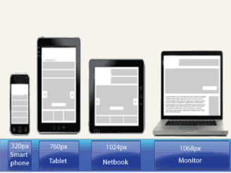
This is the story of what we learned during a redesign for our most demanding client — ourselves! In this article, I will explain, from our own experience of refreshing our agency website, why we abandoned a separate mobile website and will review our process of creating a new responsive design.
At Cyber-Duck, we have been designing both responsive websites and adaptive mobile websites for several years now.
Both options, of course, have their pros and cons. With a separate mobile website, you have the opportunity to tailor content and even interactions to the context of your users, whereas a responsive website means better content parity for users and a single website to maintain.
Why Adapt To A Responsive Design?
Our redesign story starts in August 2012. Until then, our previous strategy of having separate mobile, tablet and desktop websites didn’t exactly perform badly; they drove conversions, and user engagement appeared to be good relative to our desktop website. I should mention that this strategy was borne purely out of the need to quickly tailor our ageing desktop website to the increasing number of tablet and mobile users at the time.
We produced our tablet and mobile websites specifically with users of these devices in mind — performance was our top priority. We wanted to improve on the loading time of our “desktop” website dramatically; the desktop home page was 2.2 MB, with 84 HTTP requests, and the mobile home page was still quite large, at 700 KB, with 46 HTTP requests. We had also designed the interfaces specifically with touch in mind, using jQuery Mobile to enhance the user experience with touch gestures.
http://mobile.smashingmagazine.com/2013/06/18/adapting-to-a-responsive-design-case-study/
Author: thegoldenpipewrench+


 Have you seen our Pearltrees?
 Join us on Google+
 Follow us on Twitter
 Visit us on Facebook
 Visit our Youtube Channel
There are no comments yet.